Two-tone wall painting stands as one of the most transformative design techniques available to homeowners seeking visual depth and character in their living spaces. This approach involves applying two distinct paint colors to create horizontal, vertical, or geometric divisions that enhance architectural features while adding personality to any room. Current trends favor warmer earth tones paired with complementary hues, moving away from stark contrasts toward harmonious color relationships that promote comfort and sophistication. The technique works equally well in intimate bedrooms and expansive living areas, offering versatility that adapts to various design styles from modern minimalism to traditional elegance. Professional designers increasingly recommend two-tone walls as an affordable alternative to wallpaper or extensive renovations, providing immediate impact through strategic color placement. Whether you prefer subtle neutral combinations or bold statement contrasts, two-tone walls create focal points that guide the eye while establishing distinct zones within open floor plans. This comprehensive exploration presents diverse approaches to implementing this timeless technique across different rooms and design preferences.
1. Horizontal Living Room Split with Navy and Cream
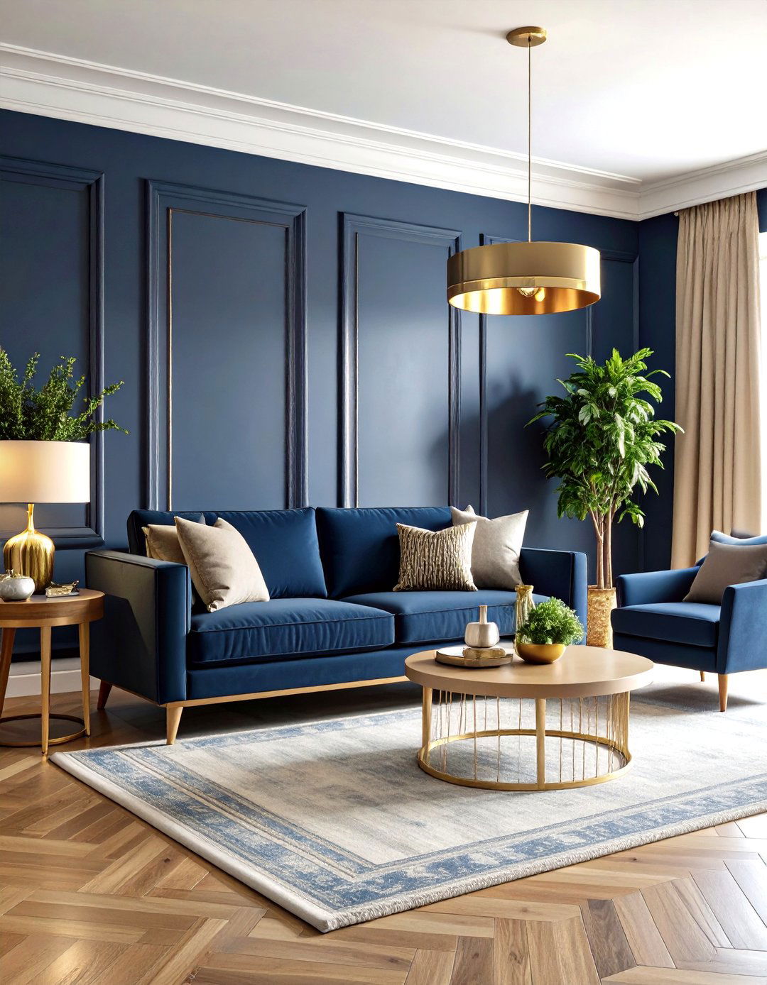
Transform your living room into a sophisticated retreat using a classic horizontal split between rich navy blue and warm cream colors. Position the dividing line at chair rail height, approximately 36 inches from the floor, with navy on the lower portion to ground the space and cream above to enhance ceiling height. This combination works beautifully with natural wood furniture, brass accents, and layered textiles in complementary tones. The navy provides depth and intimacy for evening relaxation, while cream reflects natural light during daytime hours. Complete the look with white trim work, warm wood flooring, and strategic lighting that highlights both color zones for a balanced, welcoming atmosphere.
2. Bedroom Sage Green Monochromatic Scheme
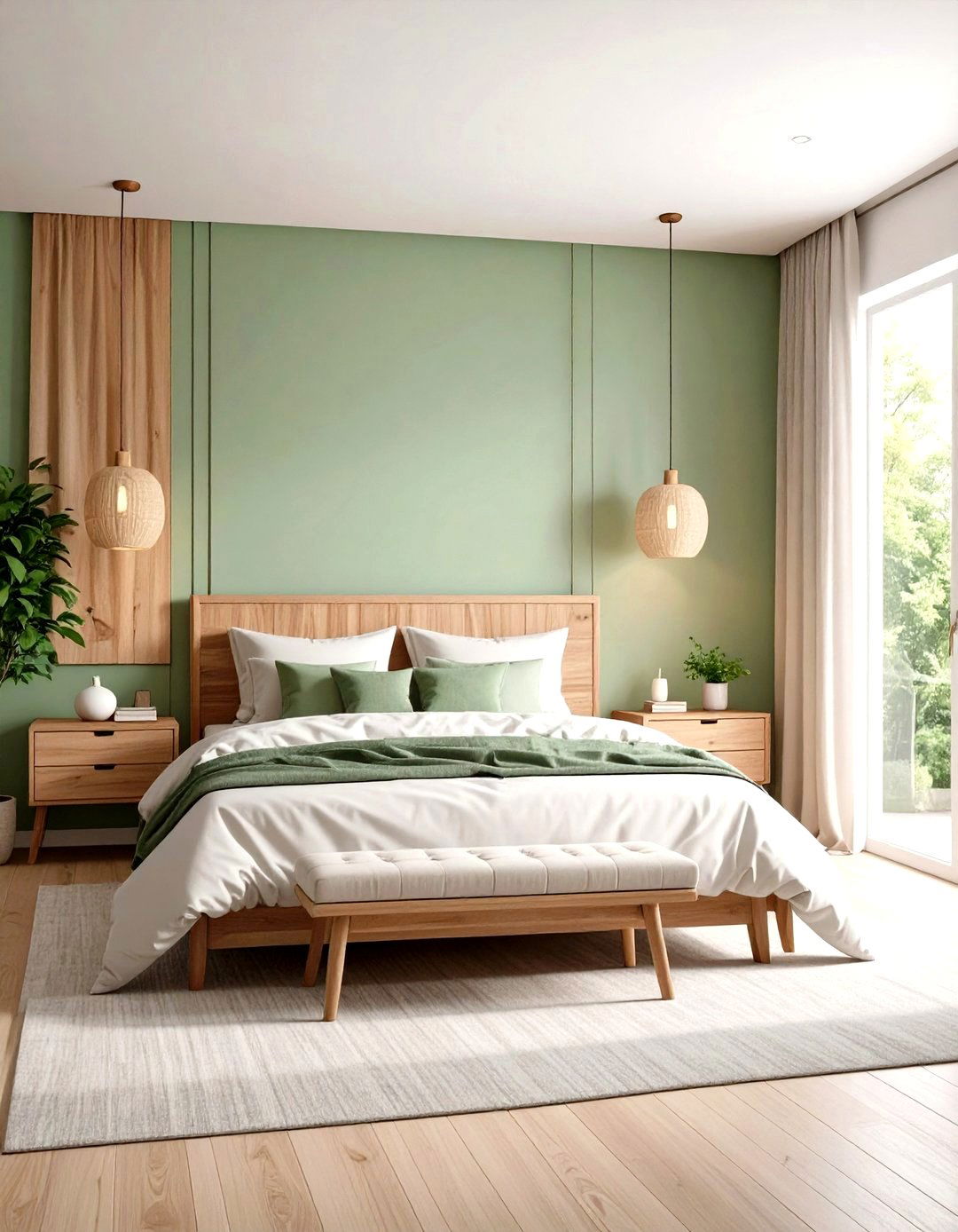
Create a calming bedroom sanctuary using two shades of sage green in a tone-on-tone approach that promotes restful sleep. Apply a lighter sage green on the upper two-thirds of the wall and a deeper forest sage on the lower third, divided at approximately 30 inches from the floor. This monochromatic scheme pairs beautifully with natural linen bedding, warm wood nightstands, and soft ambient lighting. The technique visually lowers the ceiling for a cocooning effect while maintaining the room's airy feel. Add white or cream molding details, natural fiber rugs, and plants to enhance the connection with nature. Brass or matte black hardware complements this earthy palette perfectly.
3. Kitchen Vertical Color Block Design

Divide your kitchen walls vertically to create distinct functional zones using complementary colors like warm terracotta and soft white. Paint the cooking and prep areas in terracotta while keeping dining and storage zones in crisp white, creating visual separation without physical barriers. This vertical approach works exceptionally well in galley kitchens or open-plan spaces where you want to define different activities. The warm terracotta energizes cooking areas while white maintains a clean, fresh feeling in dining spaces. Incorporate natural wood countertops, stainless steel appliances, and pendant lighting that bridges both color zones. Add plants and warm wood accessories to tie the spaces together harmoniously.
4. Dining Room Emerald and Gold Combination
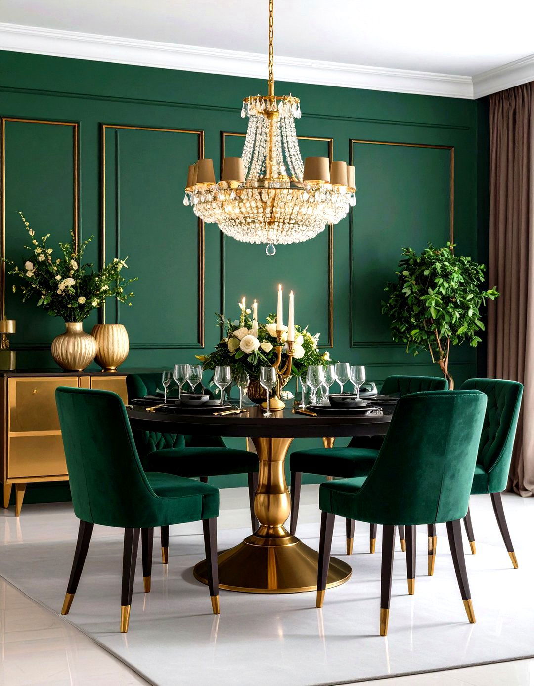
Elevate your dining experience with a luxurious horizontal split using emerald green on the lower half and metallic gold on the upper portion. Position the division at wainscoting height, around 42 inches, to create elegant proportions that complement traditional dining furniture. The emerald provides richness and sophistication while the gold adds warmth and reflects candlelight beautifully during evening meals. This combination works particularly well with dark wood furniture, crystal chandeliers, and rich fabric window treatments. Complete the design with cream or white ceiling paint, ornate molding details, and strategic accent lighting that enhances the metallic finish's reflective qualities for maximum impact.
5. Nursery Soft Pink and White Theme
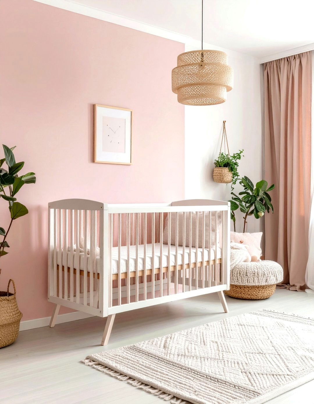
Design a gentle nursery environment using soft blush pink on the bottom half and crisp white above, creating a soothing space for rest and play. Divide the wall at approximately 40 inches to accommodate standard crib heights and future furniture arrangements. This combination promotes tranquility while maintaining brightness necessary for childcare activities. The pink provides warmth and comfort without being overwhelming, while white ensures the space feels spacious and clean. Add natural wood furniture, soft textile accents, and gentle lighting that creates a peaceful atmosphere. Consider adding removable wall decals or artwork that can evolve with your child's growth and changing preferences.
6. Bathroom Forest Green Wainscoting Style
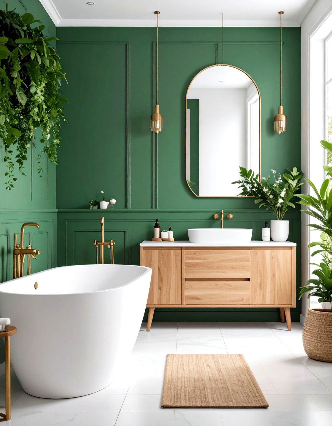
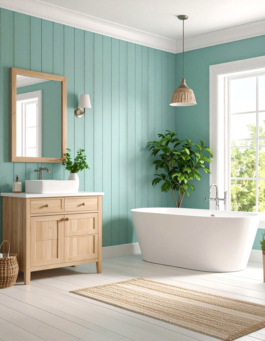
Transform your bathroom into a spa-like retreat using forest green wainscoting-style painting on the lower third and crisp white above. This classic approach, with division at 36 inches, creates visual interest while providing practical benefits in moisture-prone areas. The deep green evokes nature and tranquility while remaining sophisticated enough for adult spaces. White upper walls reflect light and maintain an airy feeling essential in smaller bathrooms. Pair with natural wood vanities, brass fixtures, and white subway tiles for a timeless aesthetic. Add plants, natural fiber textiles, and warm lighting to enhance the serene, spa-inspired atmosphere throughout the space.
7. Home Office Charcoal and Light Gray Scheme

Create a productive workspace using a sophisticated combination of charcoal gray on the lower half and light gray above, divided at desk height around 30 inches. This professional color scheme reduces visual distractions while maintaining enough contrast to prevent monotony. The darker lower portion grounds the space and hides scuffs from office chairs, while lighter upper walls keep the room from feeling closed in. This combination works beautifully with white trim, dark wood furniture, and modern lighting fixtures. Add organized storage solutions, ergonomic furniture, and strategic task lighting to create an environment that enhances focus and creativity while maintaining visual appeal.
8. Coastal Blue and White Bedroom
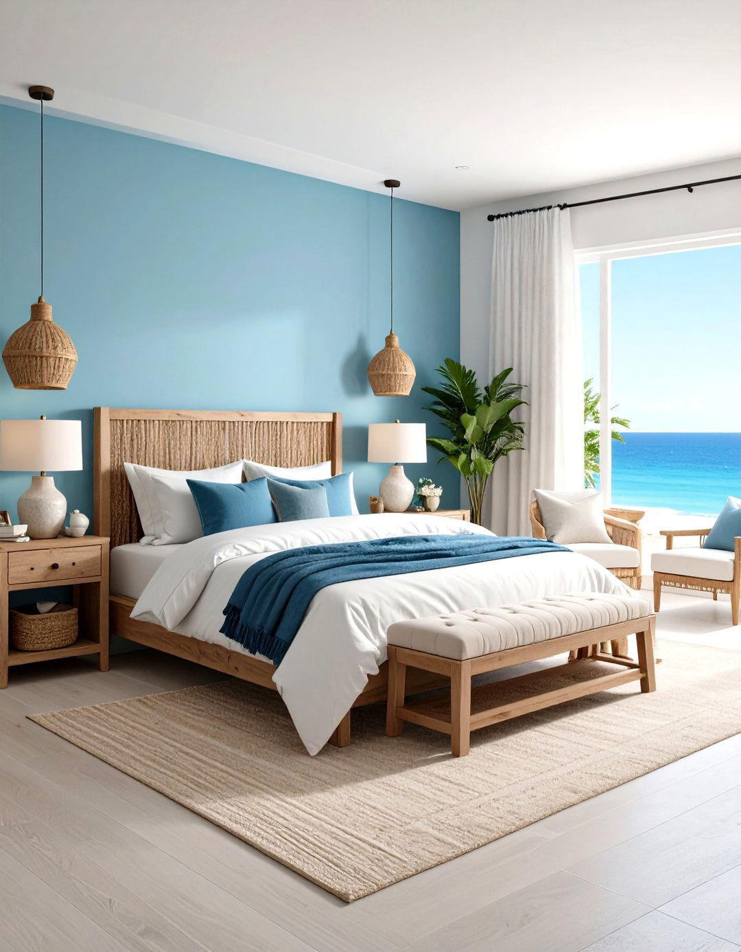
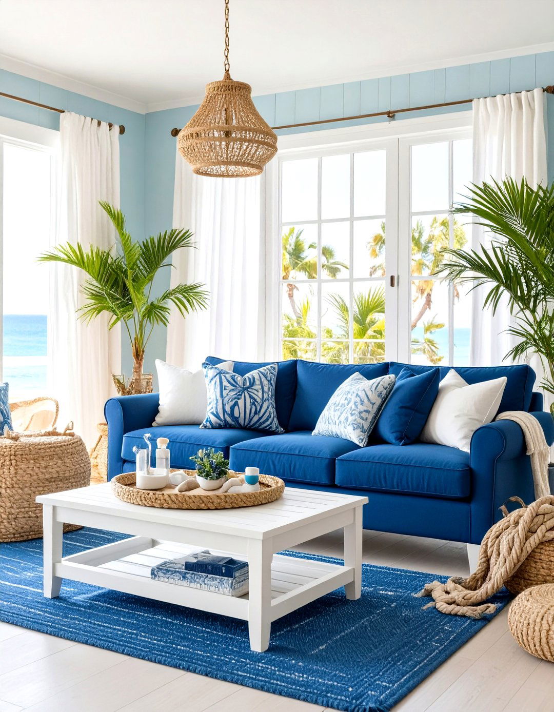
Capture seaside tranquility in your bedroom using ocean blue on the lower two-thirds and bright white above, creating a fresh, airy atmosphere reminiscent of coastal living. Position the division at approximately 45 inches to create generous proportions that work with standard bedroom furniture heights. This combination evokes calm ocean waters while maintaining brightness essential for morning routines. The blue provides restful qualities perfect for sleep while white amplifies natural light throughout the day. Complete with white or natural wood furniture, nautical-inspired accessories, and layered lighting that transitions from bright task lighting to soft ambient illumination for evening relaxation and peaceful sleep.
9. Bold Mustard and Charcoal Kitchen
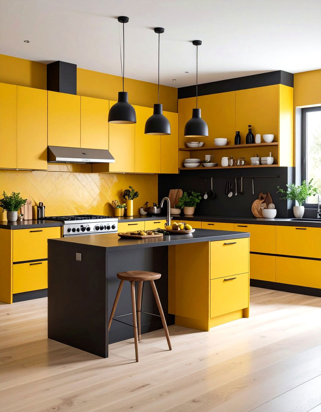
Energize your kitchen with a dynamic vertical split using warm mustard yellow and sophisticated charcoal gray to create distinct zones for cooking and dining. Apply mustard to accent walls or cooking areas while using charcoal for longer wall spans to maintain balance. This unexpected combination brings warmth and personality while remaining sophisticated enough for modern kitchens. The mustard energizes food preparation areas while charcoal provides grounding sophistication for dining zones. Pair with stainless steel appliances, natural wood accents, and industrial-style lighting. Add plants, colorful dishware displays, and warm wood cutting boards to bridge the bold color combination and create a welcoming, functional cooking environment.
10. Traditional Living Room Burgundy and Cream
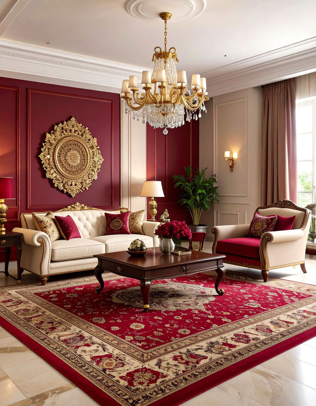
Create timeless elegance in your living room using rich burgundy on the lower half and warm cream above, establishing a sophisticated atmosphere perfect for formal entertaining. Divide at traditional wainscoting height, approximately 36 inches, to honor classic proportions while accommodating standard furniture scales. This combination provides the warmth and richness associated with traditional design while remaining current and sophisticated. The burgundy creates intimacy for conversation areas while cream maintains lightness for daily activities. Complete with dark wood furniture, brass accents, and layered lighting including table lamps and overhead fixtures. Add Persian rugs, rich fabric window treatments, and classic artwork to enhance the refined, welcoming atmosphere.
11. Playroom Rainbow Geometric Design
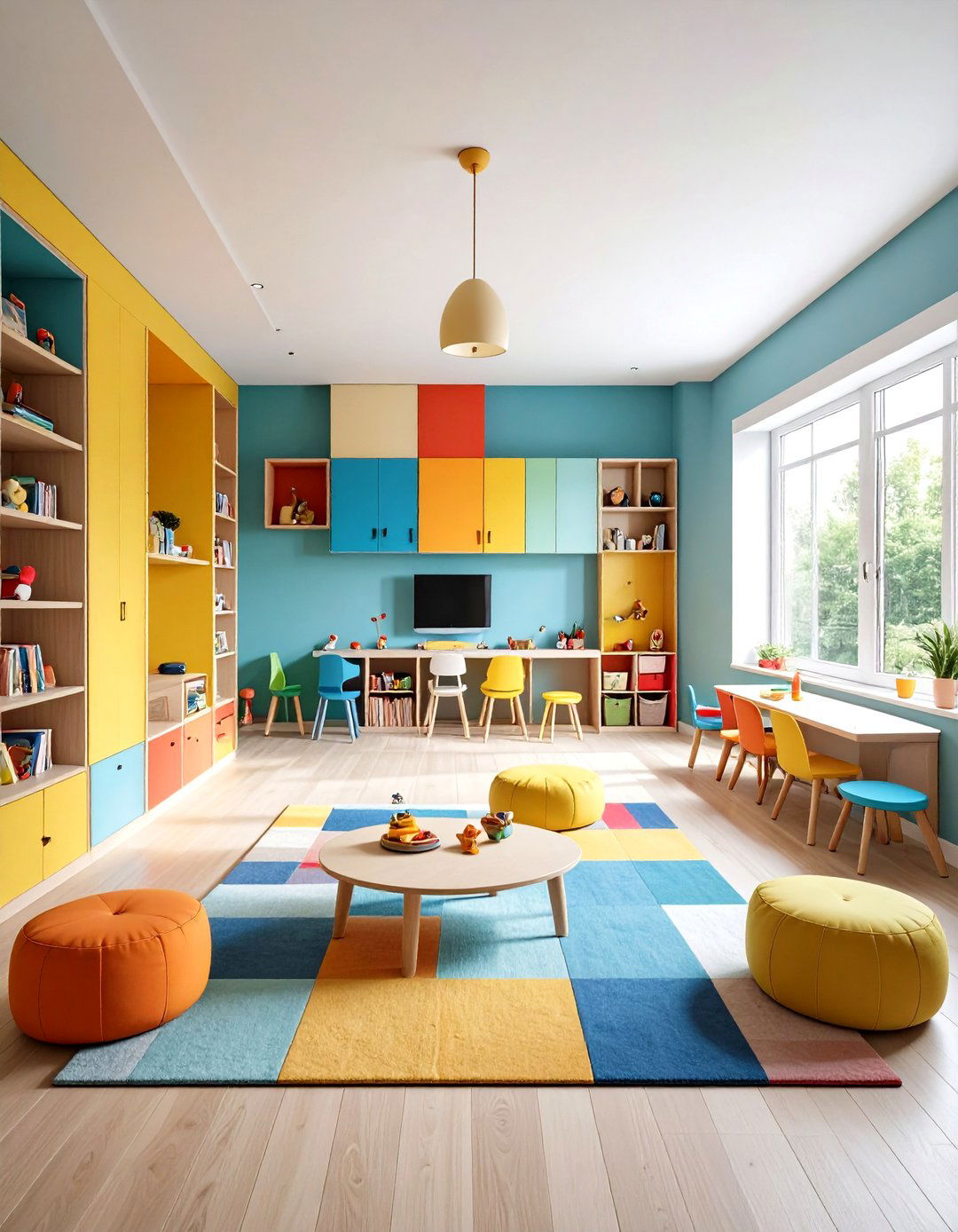
Transform your children's playroom using geometric color blocking with multiple bright colors arranged in fun, irregular shapes across the walls. Create sections using primary colors like bright blue, sunny yellow, and vibrant red alongside secondary colors like orange and green. This approach stimulates creativity and imagination while providing clear zones for different activities like reading, building, and art projects. The geometric shapes add visual interest and can incorporate educational elements like letters or numbers. Complete with colorful storage solutions, child-sized furniture, and bright LED lighting that makes colors pop. Add washable rugs, bean bags, and interactive wall elements to create an engaging, functional space that encourages active play.
12. Master Suite Mocha and Cream Elegance
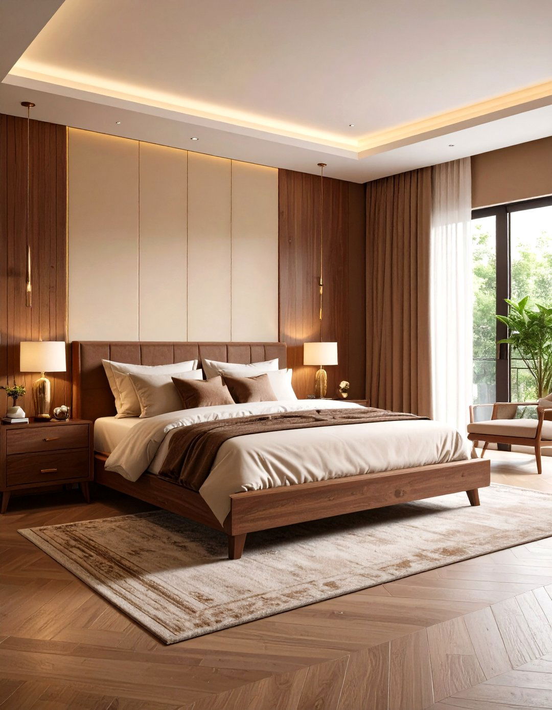
Design a luxurious master bedroom using Pantone's trending mocha brown on the lower portion and warm cream above, creating a sophisticated retreat that reflects current design preferences. Position the division at 40 inches to complement standard bedroom furniture while creating pleasing proportions. This earth-toned combination promotes relaxation while maintaining the elegance expected in primary bedrooms. The mocha provides grounding warmth perfect for evening wind-down routines while cream brightens morning activities. Enhance with rich wood furniture, metallic accents in gold or brass, and layered lighting including bedside sconces and overhead fixtures. Add luxurious textiles, plants, and artwork that complements the warm, sophisticated color palette.
13. Powder Room Black and White Drama

Create striking impact in your powder room using bold black on the lower third and bright white above, establishing dramatic contrast that makes a memorable impression on guests. This high-contrast combination works particularly well in small spaces where bold choices create personality without overwhelming daily users. The black provides sophistication and hides wear in high-traffic areas while white maintains the brightness essential in windowless powder rooms. Complete with metallic fixtures in brass or chrome, geometric tile accents, and statement lighting that highlights the dramatic color transition. Add a decorative mirror, small plants, and elegant hand towels to enhance the sophisticated, contemporary aesthetic.
14. Dining Room Terracotta and Sage Combination

Bring warmth to your dining space using earthy terracotta on the lower half and soft sage green above, creating a natural, inviting atmosphere perfect for family meals. How does this combination make you feel about gathering around the table with loved ones? Position the division at chair rail height to complement traditional dining furniture while honoring natural proportions. This earth-inspired palette promotes appetite and conversation while maintaining sophistication appropriate for formal dining. The terracotta energizes meal preparation while sage provides calming balance for extended dining experiences. Complete with natural wood furniture, warm brass lighting, and botanical artwork that reinforces the connection to natural elements throughout the space.
15. Teen Bedroom Teal and Gray Modern Style

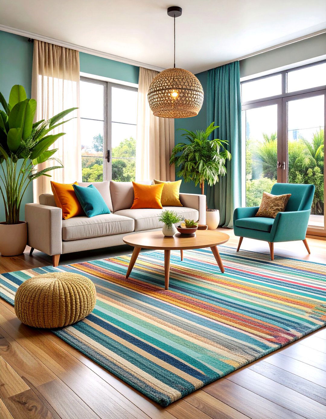
Create a contemporary teenage retreat using sophisticated teal on the lower portion and cool gray above, establishing a mature palette that grows with changing tastes. This combination provides personality without being overly juvenile, making it perfect for teenagers who want sophistication but aren't ready for adult neutrals. The teal provides energy and creativity perfect for study areas while gray offers calming balance for rest. Position the division at 35 inches to work with desk heights and standard furniture. Complete with modern furniture in white or natural wood, industrial-style lighting, and organized storage solutions. Add technology-friendly features, inspirational artwork, and flexible spaces that accommodate both study and relaxation activities.
16. Kitchen Island Two-Tone Cabinet Style
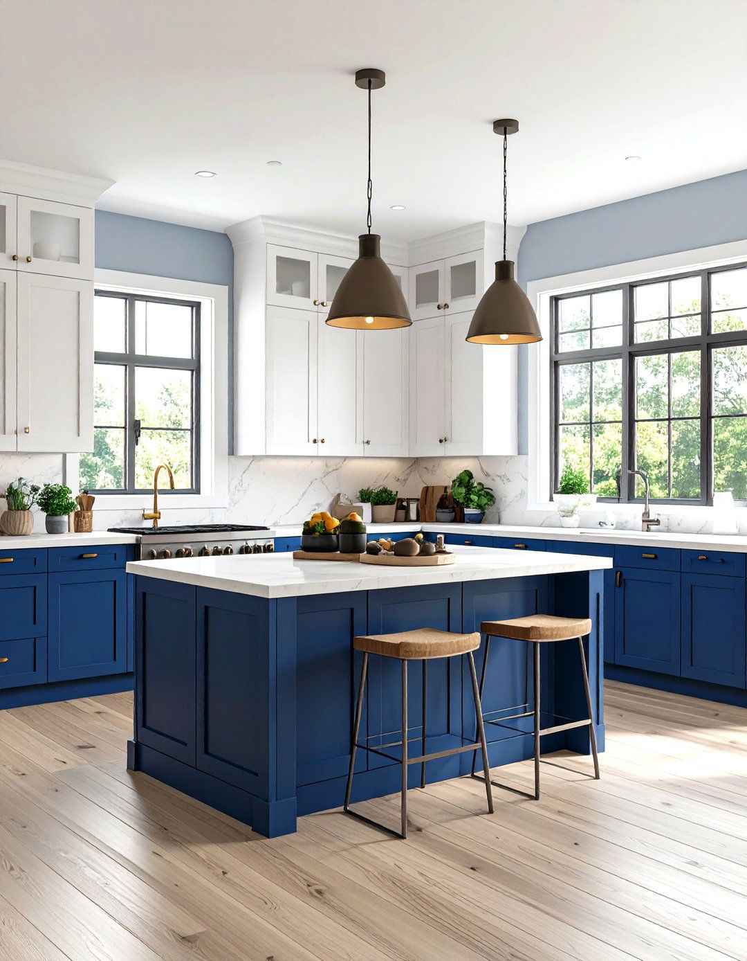
Extend two-tone concepts beyond walls to kitchen cabinetry using navy blue for lower cabinets and crisp white for uppers, creating visual weight distribution that makes kitchens feel larger and more interesting. This approach provides the benefits of two-tone design while maintaining clean wall surfaces for artwork or windows. The darker lower cabinets hide wear and fingerprints while lighter uppers prevent the space from feeling heavy or closed in. Complete with natural wood or white countertops, stainless steel appliances, and pendant lighting that bridges both color zones. Add open shelving, plants, and colorful accessories that complement both colors while maintaining the kitchen's functional efficiency and visual appeal.
17. Living Room Vertical Accent Wall Feature
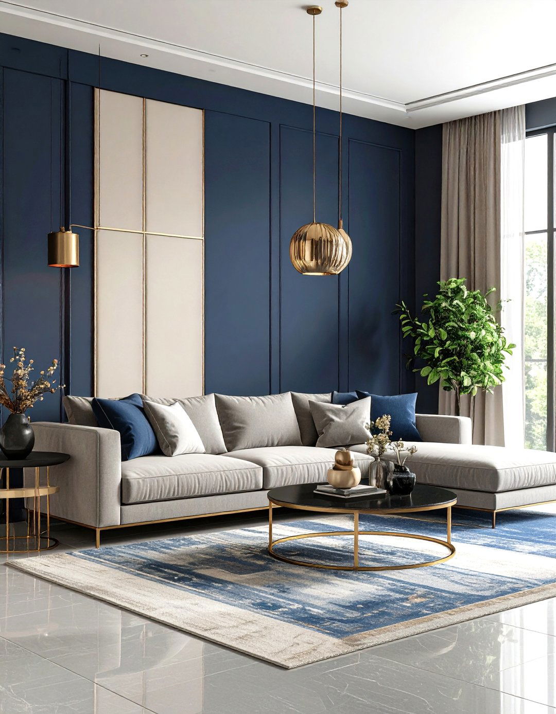
Create a stunning focal point using vertical color blocking on a single accent wall, dividing it into three sections with alternating colors like deep navy, warm cream, and soft gray. This approach draws attention to architectural features like fireplaces while maintaining neutral walls throughout the rest of the room. The vertical lines create height and drama while providing a sophisticated backdrop for furniture arrangements. Choose proportions that complement your wall's architecture, typically using the middle section for the boldest color. Complete with transitional furniture, metallic accents, and artwork that spans multiple color sections. Add lighting that highlights the color transitions for maximum visual impact.
18. Nursery Mountain Range Design
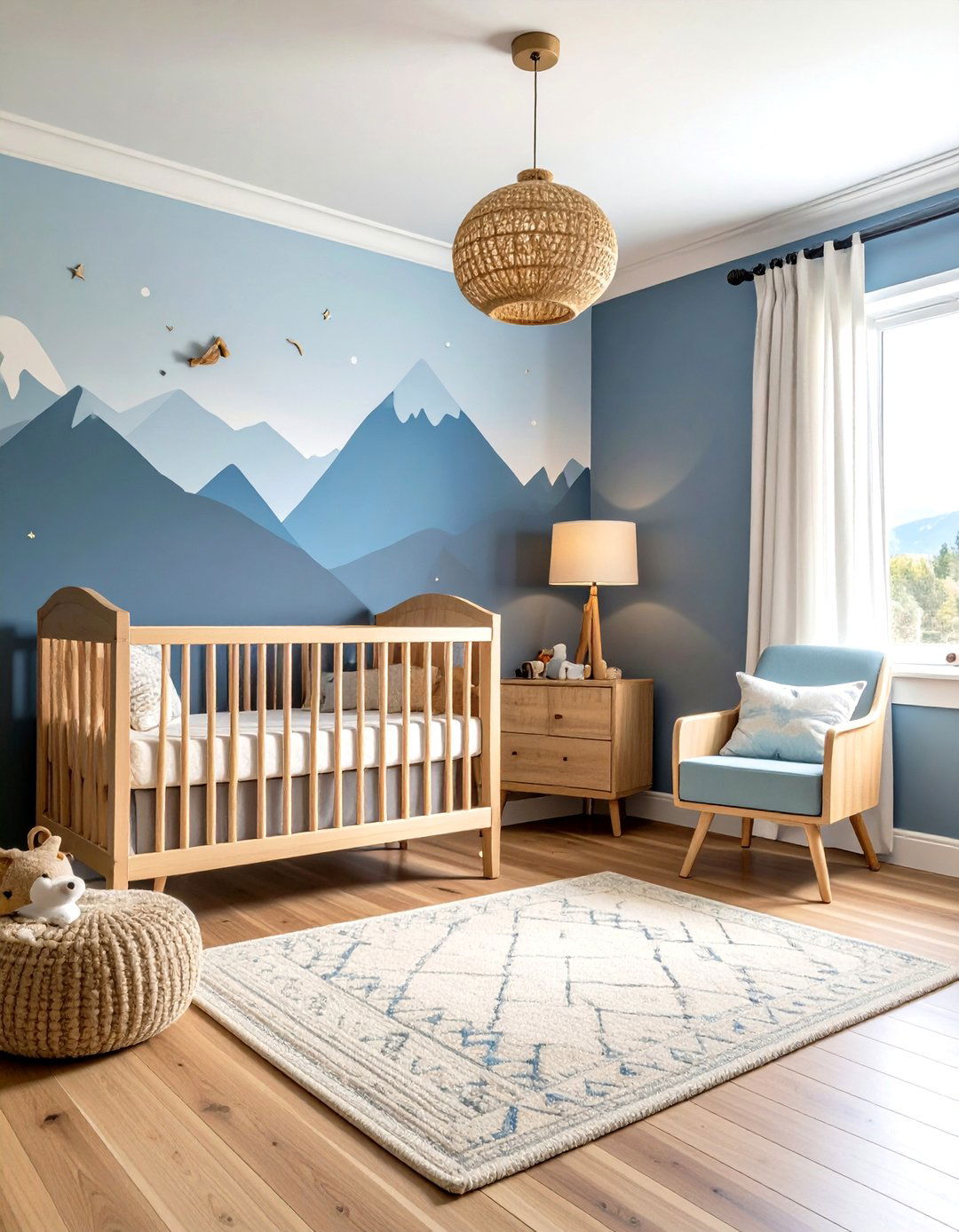
Transform your nursery walls into a whimsical mountain landscape using soft blues and greens painted in irregular mountain shapes rather than straight horizontal lines. This creative approach stimulates imagination while maintaining the calming qualities essential for infant sleep. The organic shapes provide visual interest without being overstimulating, while the natural color palette promotes tranquility. Use lighter colors for distant mountain peaks and deeper tones for foreground elements. Complete with natural wood furniture, soft textiles, and gentle lighting that creates peaceful shadows. Add woodland-themed accessories, plants, and educational elements that can grow with your child's development and changing interests throughout their early years.
19. Bathroom Spa-Inspired Blue Ombre
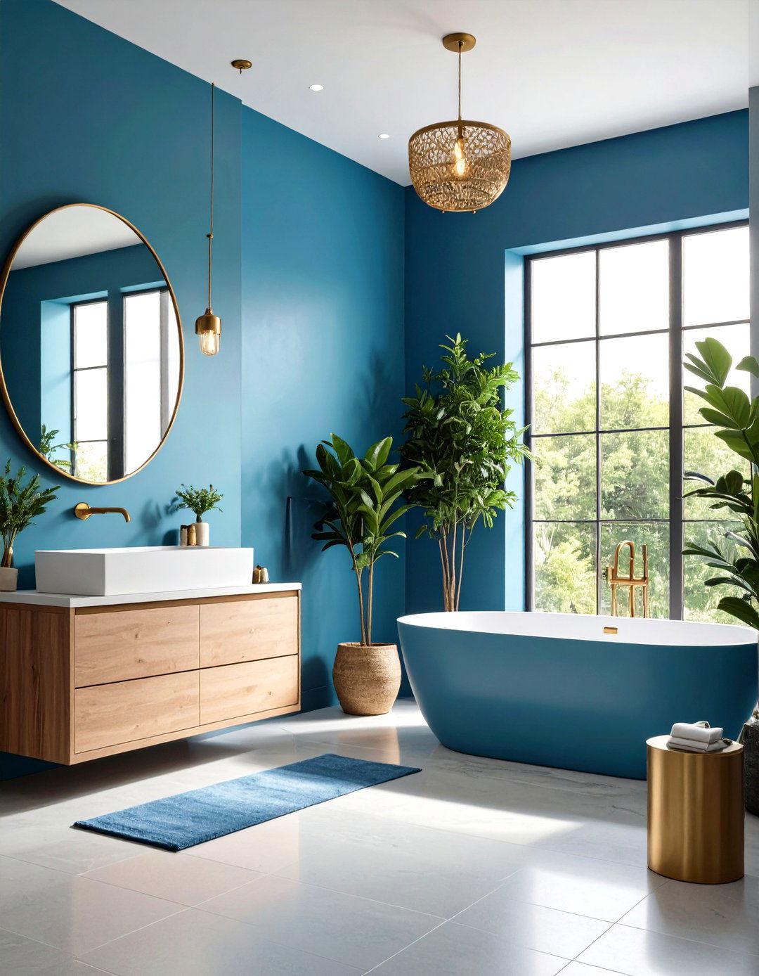
Create a serene bathroom retreat using an ombre effect that transitions from deep ocean blue at the bottom to soft sky blue at the top, mimicking natural water depth. This sophisticated technique requires careful color blending but creates a unique, spa-like atmosphere that promotes relaxation. The deeper blue at the bottom provides grounding while lighter tones above maintain airiness essential in bathrooms. Blend colors while wet for seamless transitions, or use multiple shades in subtle horizontal bands. Complete with natural stone accents, brass fixtures, and plants that thrive in humid environments. Add soft lighting, luxurious towels, and aromatherapy elements to enhance the spa experience.
20. Office Productivity-Boosting Color Zones
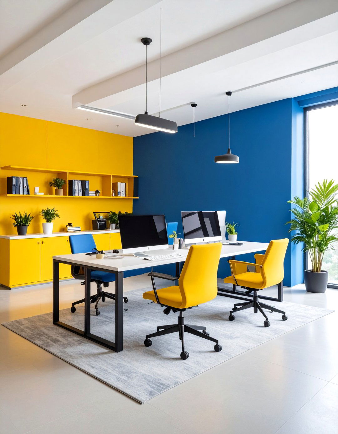
Design your home office using color psychology principles with energizing yellow on accent walls for creativity and calming blue on longer walls for focus. This strategic approach uses color to support different work activities while maintaining visual cohesion throughout the space. The yellow stimulates creative thinking and problem-solving while blue promotes concentration during detailed tasks. Position colors to support your workflow, with creative zones getting warm colors and analytical areas receiving cool tones. Complete with ergonomic furniture, organized storage systems, and adjustable lighting that supports various work activities. Add plants, inspirational artwork, and technology solutions that enhance productivity while maintaining the space's aesthetic appeal.
21. Bedroom Romantic Blush and Dove Gray

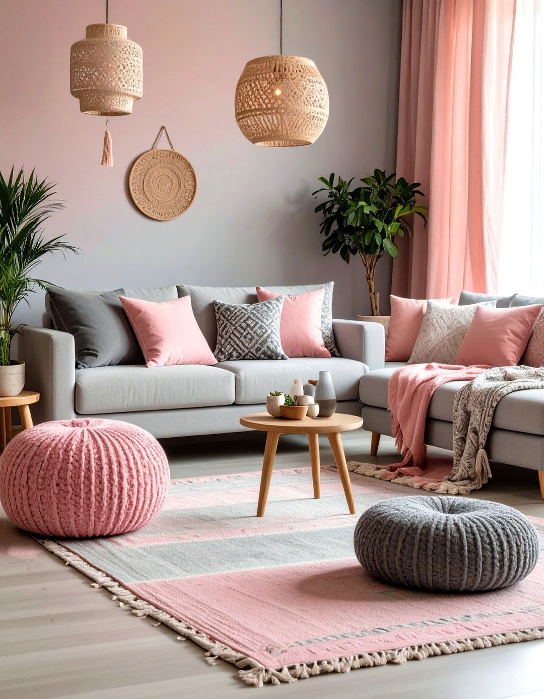
Create an intimate bedroom sanctuary using soft blush pink on the lower half and sophisticated dove gray above, establishing a romantic yet mature atmosphere. Why does this color combination feel so naturally calming and romantic? Position the division at 38 inches to complement standard bedroom furniture while creating pleasing visual proportions. This sophisticated palette provides warmth without being juvenile while maintaining the serenity essential for restful sleep. The blush adds gentle warmth perfect for intimate moments while gray provides calming balance for relaxation. Complete with white or cream trim, metallic accents, and soft lighting that creates ambiance. Add luxurious textiles, fresh flowers, and artwork that enhances the romantic, sophisticated aesthetic.
22. Kids' Bathroom Playful Primary Colors
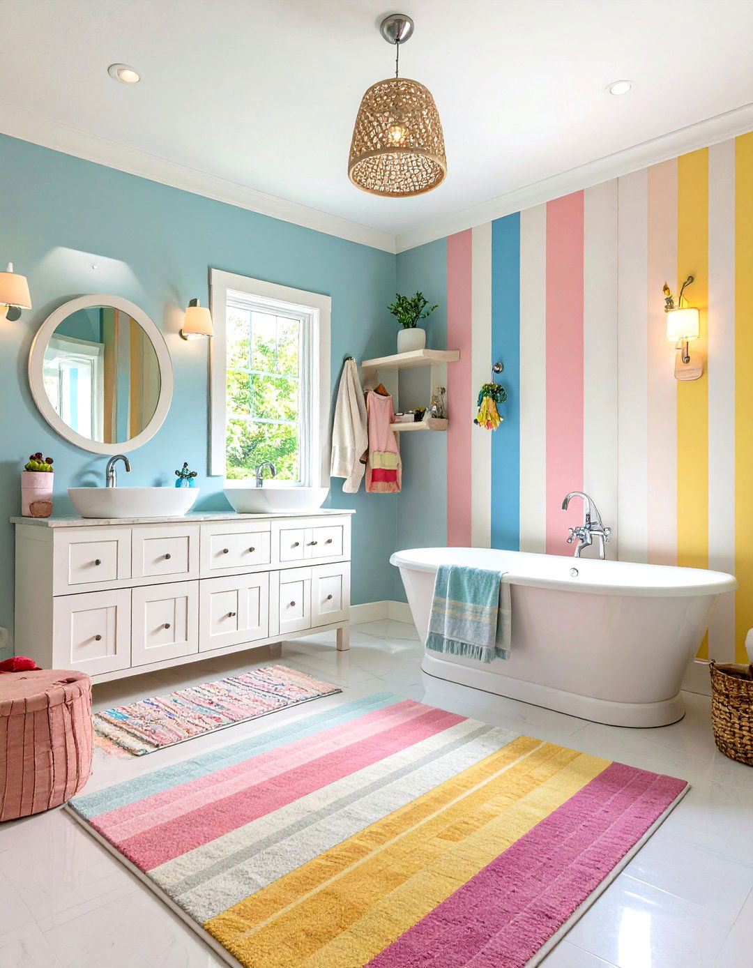
Transform children's bathroom time into fun experiences using bright primary colors in horizontal stripes or geometric patterns that make daily routines more engaging. Use washable paint finishes that withstand moisture and frequent cleaning while maintaining vibrant colors that appeal to children. Create zones for different activities like tooth brushing and bathing using color coordination that helps establish routines. The bright colors stimulate positive associations with hygiene while providing visual interest during bath time. Complete with colorful accessories, fun mirrors, and child-height storage solutions. Add non-slip rugs, playful artwork, and interactive elements that make bathroom routines enjoyable while maintaining safety and functionality throughout the space.
23. Dining Room Jewel Tone Sophistication
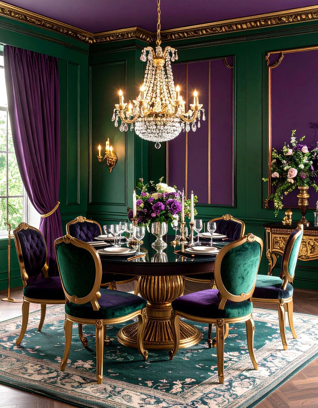
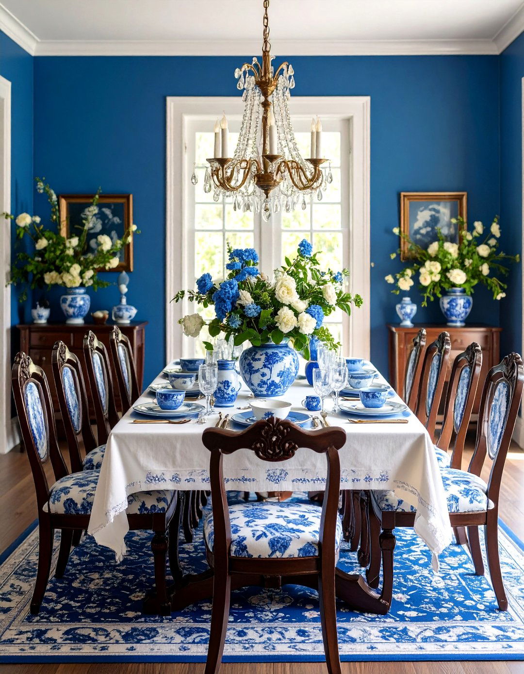
Elevate formal dining experiences using rich jewel tones like emerald green on the lower portion and deep amethyst purple above, creating luxurious atmosphere perfect for special occasions. This bold combination works best in larger dining rooms with adequate natural light to prevent the space from feeling too dark. The rich colors create intimacy perfect for dinner parties while maintaining sophistication appropriate for formal entertaining. Position the division to complement your dining furniture scale and room proportions. Complete with metallic accents, crystal lighting, and rich fabric window treatments. Add fine china displays, fresh flowers, and artwork that complements the jewel-toned palette while enhancing the room's elegant, festive atmosphere.
24. Multipurpose Room Flexible Color Zoning
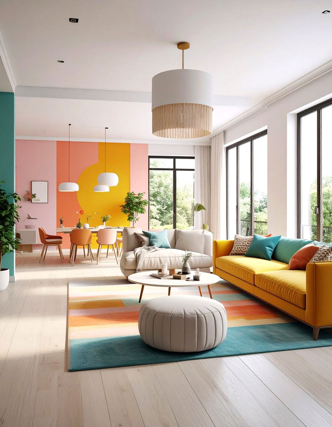
Design versatile spaces using color zones that define different functions within open-plan areas, such as warm colors for social zones and cool colors for work areas. This approach helps organize multipurpose rooms without physical barriers while maintaining flow between different activities. Use vertical divisions to separate home office areas from family spaces, or horizontal divisions to create distinct ceiling zones. The color boundaries help establish mental separation between work and relaxation while maintaining the openness essential in modern living. Complete with flexible furniture arrangements, varied lighting solutions, and storage systems that support multiple functions. Add rugs, plants, and artwork that bridge different zones while maintaining each area's distinct identity and purpose.
Conclusion:
Two-tone wall painting offers endless possibilities for transforming living spaces through strategic color application that enhances both function and aesthetics. From subtle neutral combinations that create sophisticated elegance to bold contrasts that make dramatic statements, this technique adapts to every design preference and room requirement. The key to successful implementation lies in understanding color relationships, proper proportion planning, and consideration of each room's unique lighting conditions and functional needs. Current trends favor earth-tones and nature-inspired palettes that promote wellness and connection to the natural world, while classic combinations like navy and white remain timelessly appealing. Whether you choose horizontal splits for traditional elegance, vertical divisions for modern impact, or creative geometric patterns for playful spaces, two-tone walls provide affordable transformation that delivers professional-quality results with careful planning and execution.









Leave a Reply